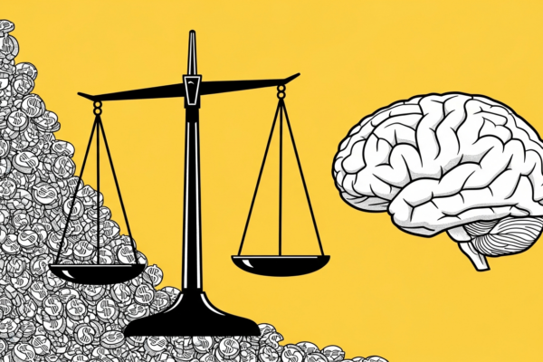
Consumers form an opinion about a product within 90 seconds of first seeing it, and up to 90% of that judgment is based on color alone. Color psychology in marketing is not a design preference. It is a measurable driver of attention, trust, and conversion across every channel you operate.
Yet most marketers still pick colors based on personal taste.
The research is clear. A study published by Satyendra Singh at the University of Winnipeg in the journal Management Decision found that color accounts for 62% to 90% of a consumer’s initial product assessment. Research attributed to the University of Loyola Maryland suggests that color increases brand recognition by up to 80%, though the original study examined color’s role in information processing more broadly. These are not small effects. They are among the largest influence factors in the entire marketing toolkit, and they cost nothing to implement correctly.
What Is Color Psychology? And Why It Matters for Marketers
Color psychology is the study of how colors influence human perception, emotion, and behavior. In marketing, it applies to every visual touchpoint: logos, packaging, advertisements, websites, call-to-action buttons, and retail environments.
The Science Behind Color Perception
Color perception starts in the eye but finishes in the brain.
When light hits the retina, photoreceptor cells send signals to the visual cortex, which processes hue, saturation, and brightness. But the emotional and behavioral response to color is shaped by a combination of biology, learned associations, and cultural context. Red triggers a physiological arousal response in most humans, which is biological. But whether red signals “danger,” “celebration,” or “good fortune” depends on where you grew up.
This is why simplistic color psychology charts fail in practice. The biology is universal, but the meaning is contextual.
90 Seconds to a Snap Judgment: The Research
The University of Winnipeg research that established the 90-second figure has been widely cited in marketing for good reason.
It quantifies something marketers have always intuited: first impressions are visual, and color dominates visual processing. In a retail environment, this means your packaging color is the first brand signal a consumer processes. In digital advertising, your ad color palette determines whether a thumb stops scrolling. In email marketing, your CTA button color influences whether the reader clicks or closes.
The implication is straightforward. Color decisions deserve the same strategic rigor as headline copy and target audience selection.
What Each Color Signals to Consumers
Every color carries associations, but those associations are not fixed rules. Think of them as starting points that your brand context can reinforce, modify, or override.
Red: Urgency, Passion, and Impulse
Red increases heart rate and creates a sense of urgency. Coca-Cola, Target, and Netflix all use red as a primary brand color.
In advertising, red performs well for clearance sales, limited-time offers, and food brands. Fast food chains use red extensively because it stimulates appetite and conveys speed. Red CTA buttons often outperform green in A/B tests, though this is not universal. The effect depends on the surrounding color palette and page design.
Blue: Trust, Dependability, and Calm
Blue is the world’s most popular color and the most common choice for corporate brands.
Facebook, LinkedIn, IBM, Samsung, and PayPal all chose blue for a reason. It signals trust, security, and professionalism. Financial services and technology companies gravitate toward blue because their customers need to feel safe. Blue also suppresses appetite, which is why you rarely see it in food branding.
The risk with blue is that it’s safe to the point of being invisible. In a category where every competitor uses blue, choosing blue means choosing to blend in.
Green: Health, Growth, and Sustainability
Green communicates naturalness, health, and environmental responsibility.
Whole Foods, Starbucks, and Spotify use green, each for different strategic reasons. For Whole Foods, green reinforces the organic and natural positioning. For Starbucks, it conveys a calming, welcoming atmosphere. For Spotify, it differentiates from the blues and reds dominating the tech space. Brand positioning determines whether green reads as “healthy,” “wealthy,” or “techy.”
Yellow: Optimism and Attention
Yellow is the first color the human eye processes, making it the strongest attention-grabber.
McDonald’s golden arches, Snapchat’s logo, and IKEA’s brand identity all leverage yellow’s ability to stand out. In advertising, yellow works well for window displays and point-of-sale materials because it catches the eye at a distance. The limitation is readability. Yellow text on white backgrounds is nearly invisible, and overuse creates visual fatigue.
Orange: Affordability and Action
Orange combines red’s energy with yellow’s friendliness.
Amazon, Fanta, Nickelodeon, and Home Depot use orange to communicate approachability and value. In digital marketing, orange CTA buttons perform well because they stand out against most page designs without the aggression of red. Orange signals affordability, which makes it a strong choice for value-oriented brands but a risky one for luxury positioning.
Purple: Luxury and Creativity
Purple has historically been associated with royalty because purple dye was expensive to produce.
Cadbury, Hallmark, and Yahoo use purple, though for different reasons. In marketing, purple communicates creativity, luxury, and imagination. It is underused in most industries, which creates differentiation opportunities. Beauty brands and premium chocolate brands use purple effectively to signal indulgence.
Black and White: Premium and Simplicity
Black communicates luxury, exclusivity, and sophistication. White communicates simplicity, purity, and modernity.
Apple’s minimalist white aesthetic, Chanel’s black-and-white identity, and Nike’s black swoosh all demonstrate how achromatic colors project premium positioning. In advertising, black backgrounds make product photography pop. White space signals confidence. The combination of black and white is the most versatile palette in branding because it works across every medium without modification.
Color Psychology in Branding: Context Over Rules
The most important insight from color psychology research is that appropriateness matters more than any universal color association.
A 2006 study by Bottomley and Doyle found that the relationship between brand and color depends on the “perceived appropriateness” of the color for the brand’s personality, not on any fixed color-emotion link. In other words, consumers don’t just ask “what does this color mean?” They ask “does this color fit this brand?”
| Brand | Primary Color | Brand Personality | Why the Color Works |
|---|---|---|---|
| Coca-Cola | Red | Excitement, energy, happiness | Red amplifies the emotional, celebratory positioning |
| Tiffany & Co. | Robin egg blue | Elegance, exclusivity, romance | Proprietary color creates instant recognition |
| Whole Foods | Green | Natural, healthy, organic | Green reinforces the core brand promise |
| T-Mobile | Magenta | Bold, rebellious, energetic | Stands out against blue telecom competitors |
| Apple | White/Silver | Minimalist, premium, innovative | Absence of color signals design sophistication |
| McDonald’s | Red + Yellow | Fast, fun, family-friendly | High-visibility combination stimulates appetite and urgency |
The Von Restorff Effect and Differentiation
The Von Restorff effect, also called the isolation effect, states that items that stand out from their surroundings are more likely to be remembered.
Applied to color in marketing, this means your color choice should differentiate you from competitors, not follow category conventions. When T-Mobile chose magenta in a sea of blue telecoms, it wasn’t random. It was strategic differentiation through color. The brand is now so associated with magenta that its parent company Deutsche Telekom has trademarked the color in the telecommunications space and aggressively defends it against competitors.
If your competitors all use blue, the smartest color choice might be anything except blue.
Why “Appropriate” Beats “Universal”
Research from the University of Missouri found that specific logo colors have a significant impact on how consumers view the brand, with perceived “fit” mattering more than abstract color meanings.
A financial institution using red might trigger anxiety rather than excitement, because consumers expect trust signals from banks. A children’s toy brand using black might confuse parents who expect bright, playful colors. The same color creates different responses depending on the product category, the target audience, and the competitive context.
Start with your brand equity and personality, then choose colors that reinforce it.
How Color Performs in Advertising Campaigns
Beyond branding, color has a direct, measurable impact on advertising performance. Here’s what the data shows across channels.
CTA Button Colors and Conversion Data
The “red vs green button” debate is one of the longest-running arguments in conversion optimization.
HubSpot’s widely cited 2011 A/B test showed a red CTA button outperforming green by 21%. But this result is misleading if taken out of context. The winning button was the one that created the most visual contrast against the page background. On a predominantly green page, a red button pops. On a red page, a green button pops. The principle is contrast and conversion rate optimization, not “red beats green.”
Test your CTA colors against your specific page design, not against universal best practices.
Color in Social Media Advertising
Social media feeds are visually noisy environments where your ad competes with personal photos, videos, and other ads for attention.
Industry testing indicates that ads with high color contrast stop scrolling more effectively than muted or monochromatic ads. Bright, saturated colors perform well on Instagram and Facebook because they stand out against the platform’s white interface. On darker-themed platforms like Twitter/X in dark mode, lighter colors create the necessary contrast.
Match your ad color palette to the platform’s visual environment, not just to your brand guidelines.
Color in Email Marketing
Email is a constrained visual environment, which makes color choices even more impactful.
Campaign Monitor data shows that emails with a single CTA receive 371% more clicks than those with multiple calls to action. The reason is cognitive load. Too many colors compete for attention. One clear color signal guides the reader’s eye to the desired action. In email subject lines, color doesn’t apply, but in email body design, your CTA color is the single most influential visual element.
Cultural Context: How Color Meaning Shifts Globally
Any marketer running global campaigns must understand that color meanings are not universal. What works in New York may fail in Dubai or Tokyo.
Western Markets
In North America and Western Europe, the associations discussed in this article largely apply.
White signals purity and is worn at weddings. Black signals mourning and is worn at funerals. Red signals excitement, danger, or passion. These associations are deeply embedded through cultural repetition over centuries, but they are cultural, not biological.
Middle Eastern and Asian Markets
In the Middle East, green holds special significance as the color of Islam and is associated with paradise, fertility, and prosperity.
White, not black, is the traditional mourning color in many Asian cultures, including China and India. Red in China signals luck, prosperity, and celebration, which is why Chinese New Year and weddings feature red prominently. A Western brand using white packaging to signal “purity” in the Chinese market might inadvertently signal “death.” These are not trivial distinctions. They can make or break a product launch.
Conduct cultural color audits before entering new markets. What feels “premium” in one culture may feel “ominous” in another.
Gender, Age, and Color Preference
Color preferences vary by demographic, though the differences are often smaller than marketers assume.
Researcher Joe Hallock’s study on color preferences found that blue is the most preferred color across both men and women. Purple shows the largest gender gap, preferred by 23% of women but only 1% of men. Orange is the least preferred color for both genders. Age also matters. Younger consumers tend to prefer brighter, more saturated colors, while older consumers gravitate toward softer, muted tones.
Use demographic color data as a starting hypothesis, then test with your specific market segment. Aggregate preferences are useful but never prescriptive for individual brands.
How to Choose Colors for Your Marketing: A Step-by-Step Process
Here is the process I recommend after 17 years of working with brands across categories and regions.
Step 1: Start with Brand Personality
Define your brand personality traits first.
Is your brand sophisticated or playful? Rugged or refined? Exciting or calming? Use Jennifer Aaker’s brand personality framework (sincerity, excitement, competence, sophistication, ruggedness), published in the Journal of Marketing Research, as a starting point. Then identify which colors align with those traits, using the associations above as a guide, not a rulebook.
Step 2: Audit Your Competitive Landscape
Map the primary colors of your top 10 competitors.
Look for color crowding. If every competitor in your space uses blue, a strategically different color choice gives you a built-in differentiation advantage. T-Mobile, Lyft (pink in a sea of black ride-share apps), and Spotify (green in a red and blue tech landscape) all used this approach to stand out.
Step 3: Test with Your Audience
Never finalize brand colors without testing.
Run preference tests, A/B test ad variations with different color palettes, and conduct focus groups if the budget allows. The data from your specific audience will always outperform generic color psychology advice. What works for a luxury skincare brand will not work for a budget airline, even if both are targeting the same age demographic.
Step 4: Ensure Accessibility
Approximately 300 million people worldwide have color vision deficiency, according to the Colour Blind Awareness organization.
Designing only for full-color vision excludes a meaningful segment of your audience. Use WCAG-compliant contrast ratios (minimum 4.5:1 for normal text). Avoid relying solely on color to convey critical information. Use tools like WebAIM’s contrast checker to validate your palette. Accessibility is not just ethical. It is good brand awareness strategy because it ensures your message reaches the widest possible audience.
Frequently Asked Questions
What is the best color for marketing?
There is no single best color. The most effective color is the one that is appropriate for your brand personality, differentiated from your competitors, and tested with your target audience. Blue is the safest choice. But safe and effective are not the same thing.
Does color really affect purchasing decisions?
Yes. Research from the University of Winnipeg confirms that 62% to 90% of snap product judgments are based on color. Color influences attention, emotional response, and perceived brand personality, all of which feed directly into purchase decisions. The effect is strongest in categories where products are otherwise similar.
How do I choose brand colors if I’m starting from scratch?
Start with your brand personality traits, not with personal preference. Audit competitor colors to find differentiation opportunities. Select a primary color and 1 to 2 supporting colors. Test variations with your target audience. Then codify your palette in a brand style guide to ensure consistency across all touchpoints.
What colors increase conversions on websites?
High-contrast CTA buttons consistently outperform low-contrast ones, regardless of specific color. The principle is visual contrast, not universal color preference. Test red, orange, and green CTA buttons against your specific page background. The winner will be the color that creates the most visual pop in your design, not the color a best practices blog recommended.
Color is one of the most underused strategic tools in the marketing toolkit. For more on how psychology drives consumer behavior, see our deep dive on emotional branding strategy. And if you’re building a brand identity from the ground up, our guide to brand architecture covers how visual identity fits into the larger brand system.